Tuesday 15 October 2013

RESEARCH: THE ART OF THE TITLE

Today I started to research film openings using the website THE ART OF THE TITLE www.artofthetitle.com


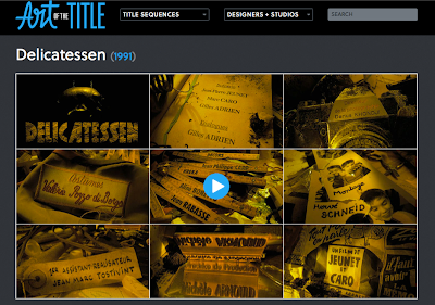
Delicatessen - directed by Juan-Pierre Jeunet and Marc Caro, 1991
For my first piece of detailed analysis, I used my observations, class discussions and the websites commentary including that of Karin Fong, creative director and designer at Imaginary Forces. 

The title design is unique and goes along with the genre of black comedy. The title design is intriguing as each credit in somehow linked and placed onto items associating with the story. For example: we can see the director of photography's name engraved on a very old and rusty looking camera, therefore, representing a particular time period. Even the costume designer has his name, stitched into one of the clothes label the camera drifts over. The camera movement is very fluid, and is easily followable for the audience viewing.


Monday 14 October 2013

RESEARCH: A BRIEF HISTORY OF TITLE DESIGN

  • During today's lesson we watched a short video on 'A Brief History of Title Design'. This video showed repeatedly the starting titles to different films over the years, with the older ones starting first and then gradually more modern film titles appeared.
  • We watched this three times so that we could remember most of the details about the title types and changes that occurred over the years. You can see a big difference in the titles of older films compared to the newer films, with the newer film titles looking more crisp and in high definition, and much more in detail - therefore tending to be a lot more exciting, fun and colourful to watch. 
  • The reason why there is such a change is because of CGI, which stands for Computer Generated Imagery, which can make the titles of films and films in general a lot more exciting to watch due to the special effects we can now create using CGI. A good title design links between the graphics and the film genre, and CGI makes this possible. 
  • Although we discussed the use of CGI in detail, there are also other types of approaches used in film titles such as live actions and some film titles even mix CGI and Live Action together which makes it very exciting indeed. Below I picked five different film titles and print screened them in order to decode the iconography. 

I really like this film title in the screening and it used simple but effective graphics to show the title but also relate it to the film itself. The words 'Anatomy of a Murder' are plastered on top of a simple black figure laying down lifeless to symbolise the murder. The black background represents the mood of the film.
I chose this title on the screening because it showed the more modern type of titles screenings as it was high definition text and a plain but exuberant picture as the backing giving a mysterious feel to the film and making you want to watch more. The A and E are presented as abstract versions of the original letters to link with the title of the film 'Alien'.
I chose this title from the screening because it uses the text and font to express what the film 'The Social Network' is about - Facebook and how it was founded. It also immediately shows you a wide shot of where the film is based and I liked that aspect of it. 

I really liked this film title as well, as it uses colour to relate to film title itself and also uses CGI to produce a cartoon panther. 
This film title also caught my eye during the screening as it was a simple close up shot of an eye. Vertigo is when you have a fear of heights and therefore, the title linked with the shot itself links with the film, as you have to look through your eyes to see a height and be fearful of it.

Wednesday 9 October 2013

PRELIMINARY EXERCISE


Continuity task: our prelim exercise was to film and edit a character opening a door, crossing a room, sitting down in a chair opposite another character with whom she/he exchanges a couple of lines of dialogue. This task should demonstrate match on action, shot/reverse shot and the 180% rule.